Top Real Estate Visualizations for Week of Oct 9
Our weekly roundup of favorite visualizations in Real Estate.
This week we saw new data for housing activity and rental prices in the US real estate market. Here are our favorite charts and data visualizations regarding US real estate:
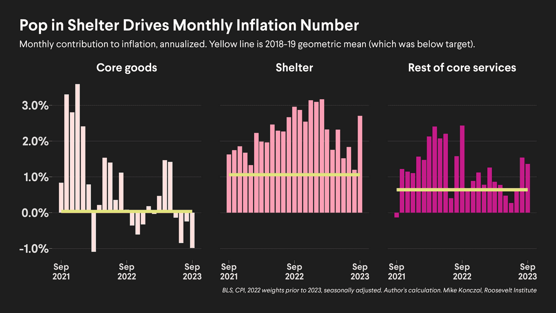
Pop in Shelter Drives Consumer Price Index Growth
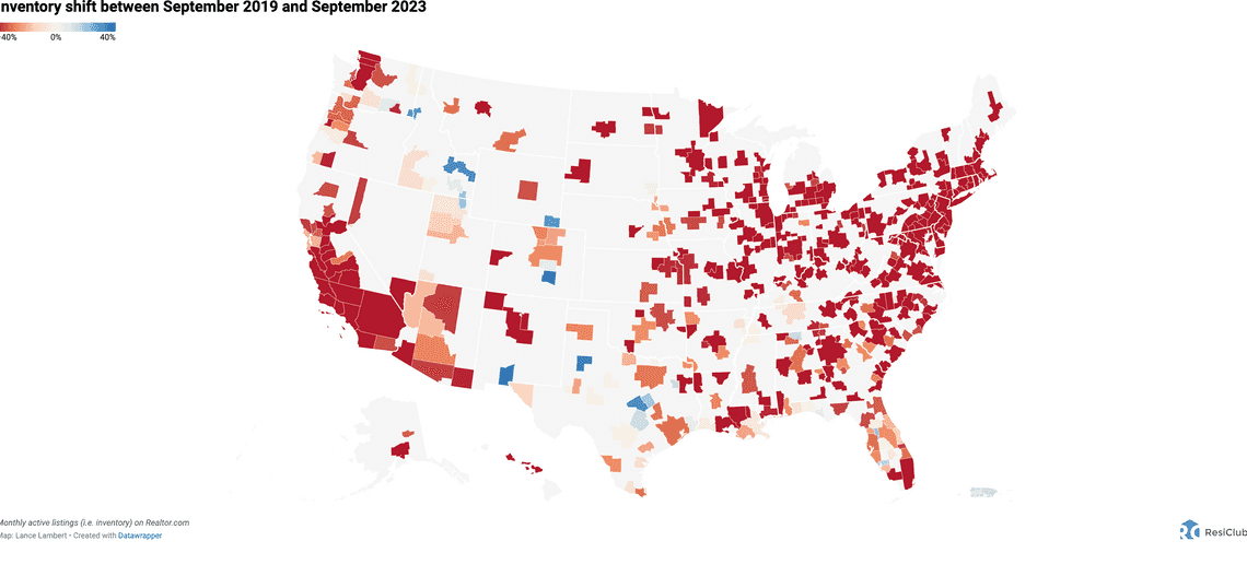
Monthly Active Listing Map by US City 2019-2023. A fantastic interactive map from Lance Lambert.
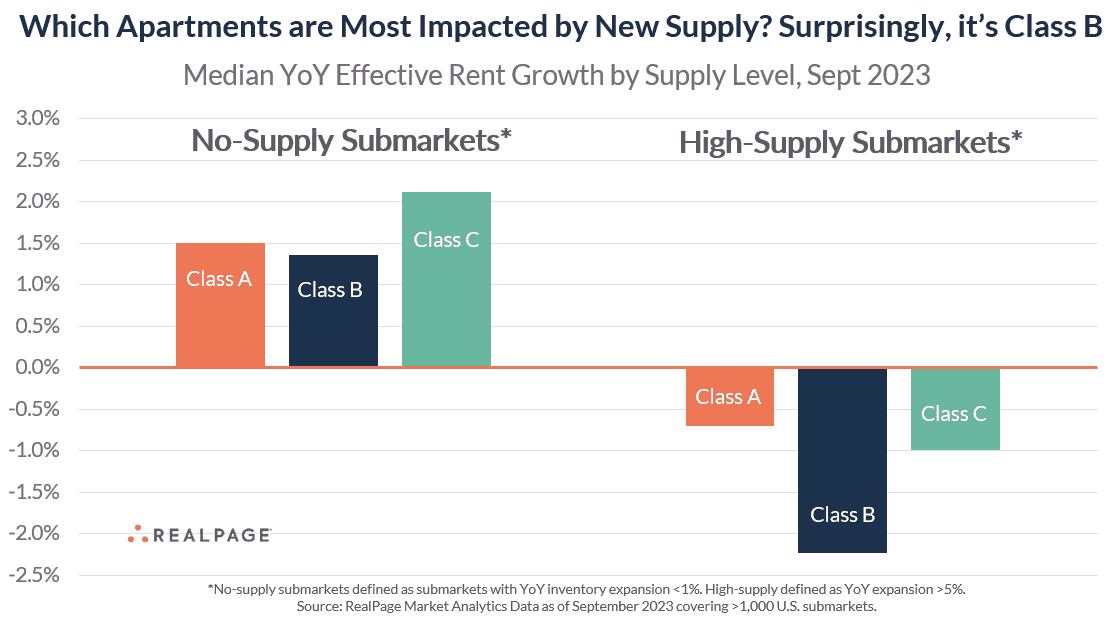
Class B apartments have been more impacted by supply than even Class A
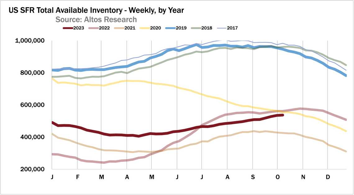
Mike Simonsen and the great folks at Altos Research show us how single family home inventory continues to climb this week - and how it is later Vs past years at the same point on the calendar.
Long rivers of the United States Long rivers of the conterminous United States of America—a beautiful visual experiment.
- Stew Langille


