Best Visualizations for the Week Nov 6
Our favorite data visualizations for the past week from amazing creators.
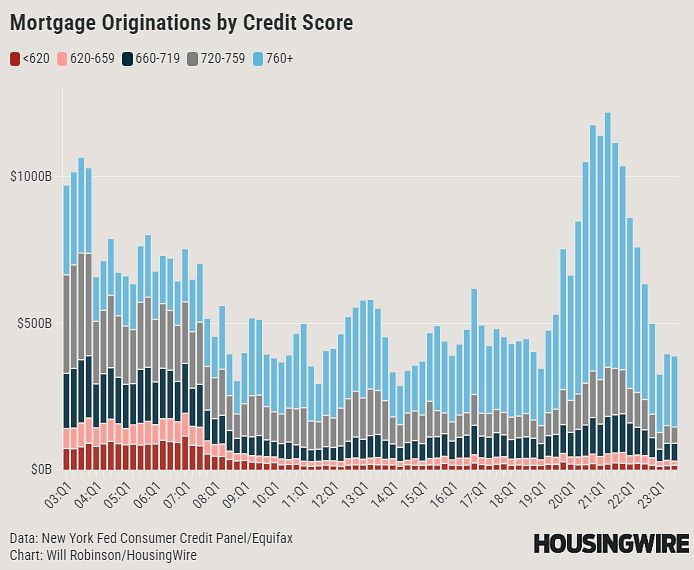
This chart from @LoganMohtasha and @HousingWire gives great insight into the credit score of mortgage borrowers over the last 20 years. Trends clearly show the lasting impact of the financial crisis on the credit profile of borrowers in the subsequent 10+ years.
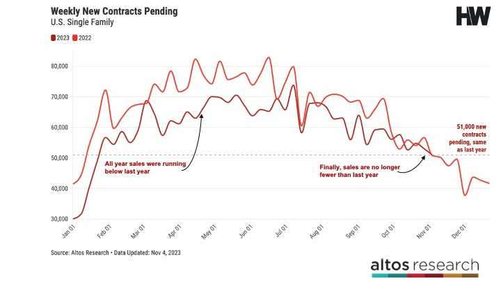
Mike Simonsen artfully explains how we might be at the beginning of turning tides in the housing market. If we are at the top with interest rates, this could be positive for sales volumes into 2024.
The talented Terence maps out the NYC Subway lines in his latest visualization. The neon tubes visually supercharge each individual line.
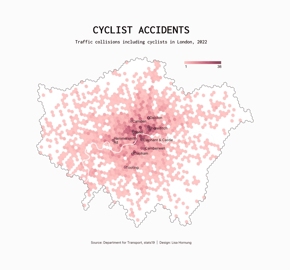
Lisa Hornung made a terrific and eye opening map of traffic collisions with cyclists in London in 2022. Most hotspots in the center and along routes with higher cyclist volumes
- Stew Langille


